How to quantify your feedback and research data
EnjoyHQ helps you aggregate and visualize your search results. Your data can be grouped by tags, properties or any attribute attached to your feedback or customer records.
Charts work in the same way in the Search area or a Project's Data section - with the only difference that project charts will only include data contained in that project.

Creating charts
Charts can be generated for all of your data in the Search area. When working on a research project, the charts will narrow down the working data set to the contents of your project. Additionally, you can use the search functionality to select only a subset of data to chart, by filtering by tags, properties, customer details and the feedback creation date:
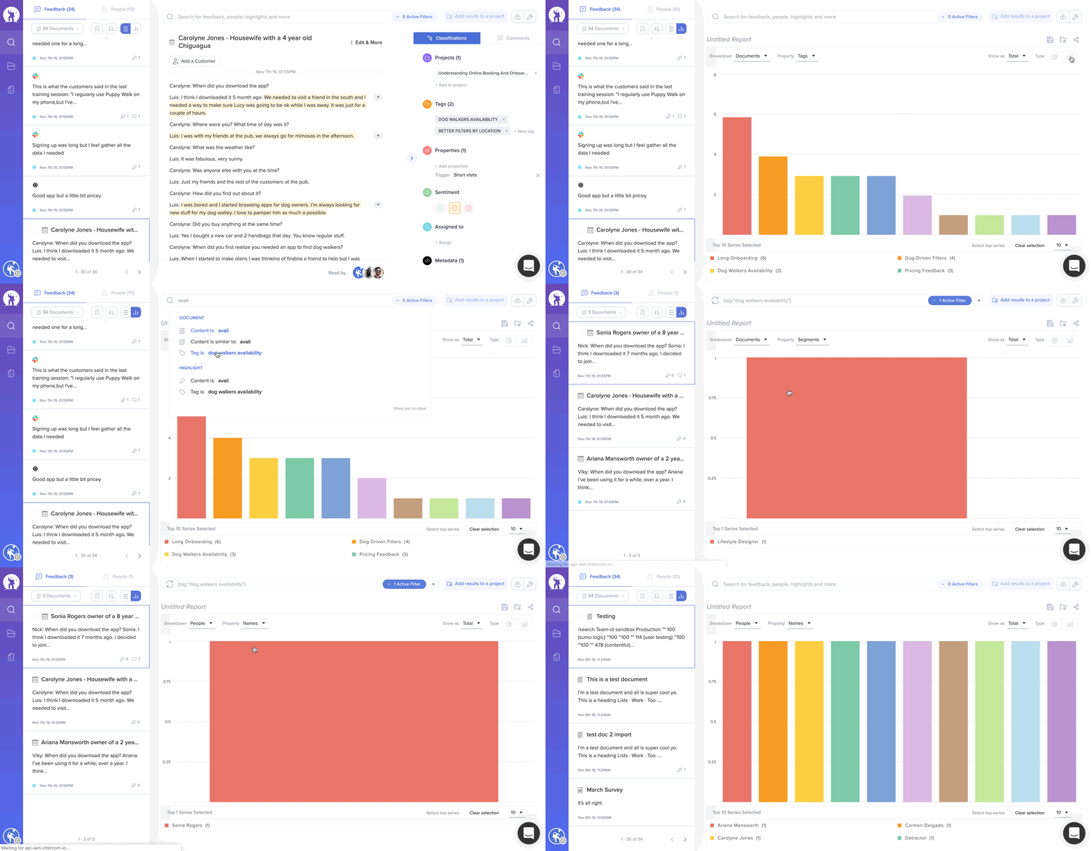
To get started you can run any search. For example, type the phrase "extend my trial", that query should return feedback from customers who mentioned they wanted a trial extension, then your data can be broken down by any attribute assigned to it:
- Documents can be broken down by their tags, properties, source, sentiment and customer properties
- Highlights can be broken down by tags, properties, sentiment and customer properties
- People data can be broken down into segments and customer properties
That way you could build charts like:
- Feature requests by customer segment.
- Top 10 product areas associated with the tag feature request
- Number of mentions of the phrase "bad ux" over time
It's all about identifying the questions you would like to answer 🤓
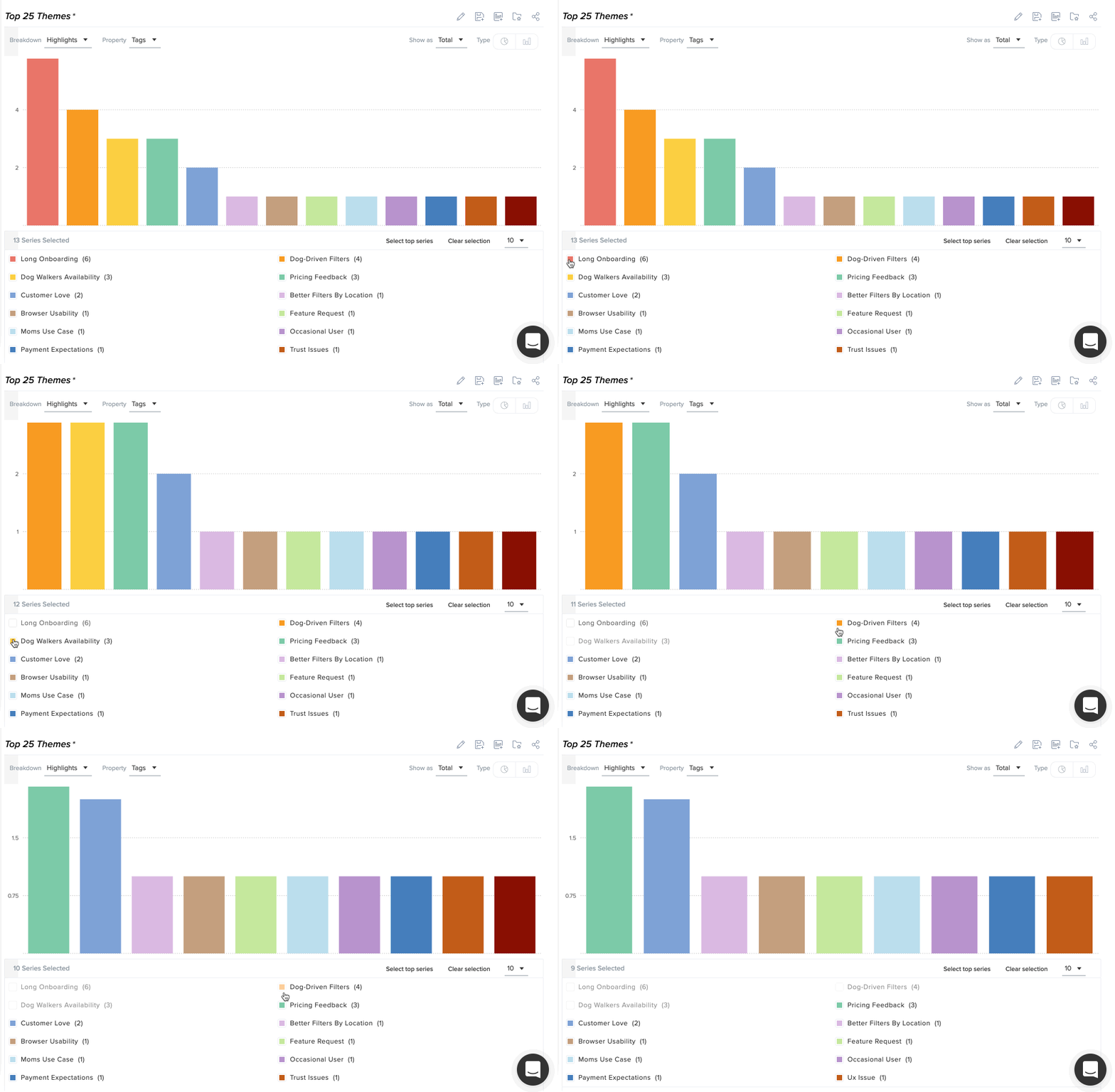
If you want to exclude some of the data series in your chart, you can toggle their visibility in the data series table:
Saving charts
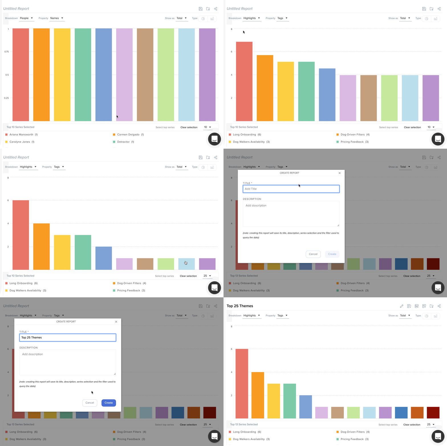
When you're happy with your chart hit "save as new" to save your changes:
Sharing charts
Once saved, a chart can be shared by:
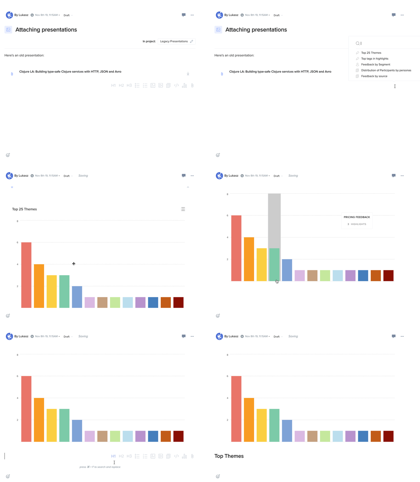
- Embedding it in a story to create a richer write-up of your research findings
- Collect multiple charts into a dashboard and share a link with your team members:
Dashboards
Saved charts can be grouped into dashboards, which then can be accessed by other members of your team. For example, if you're tracking feedback from your enterprise customers you can create the following charts:
- Customer feedback overtime (volume in last 30 days)
- Feedback by product areas.
- Top requests
- Customer feedback per channel
- Sentiment overtime
Once the chart is saved it can be added to a dashboard:
Charts can be rearranged and resized to show the data in a way that makes the most sense for given dashboard.
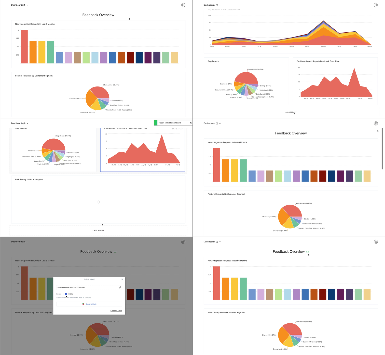
Sharing Dashboards
It's easier than ever to create and share dashboards with multiple teams outside of EnjoyHQ Create a sharing link (just like Google Docs) from within your account and send it to whomever you wish - the recipient(s) will be shown a read-only version of the data visualizations in your dashboards. Read more about sharing.
Need help building charts? Get in touch by clicking the chat bubble and we will be with you in seconds!
Creating dashboards
Dashboards can be setup once at least one chart has been created in the search area. Here's how to do it:
In the Search area switch to the charts view
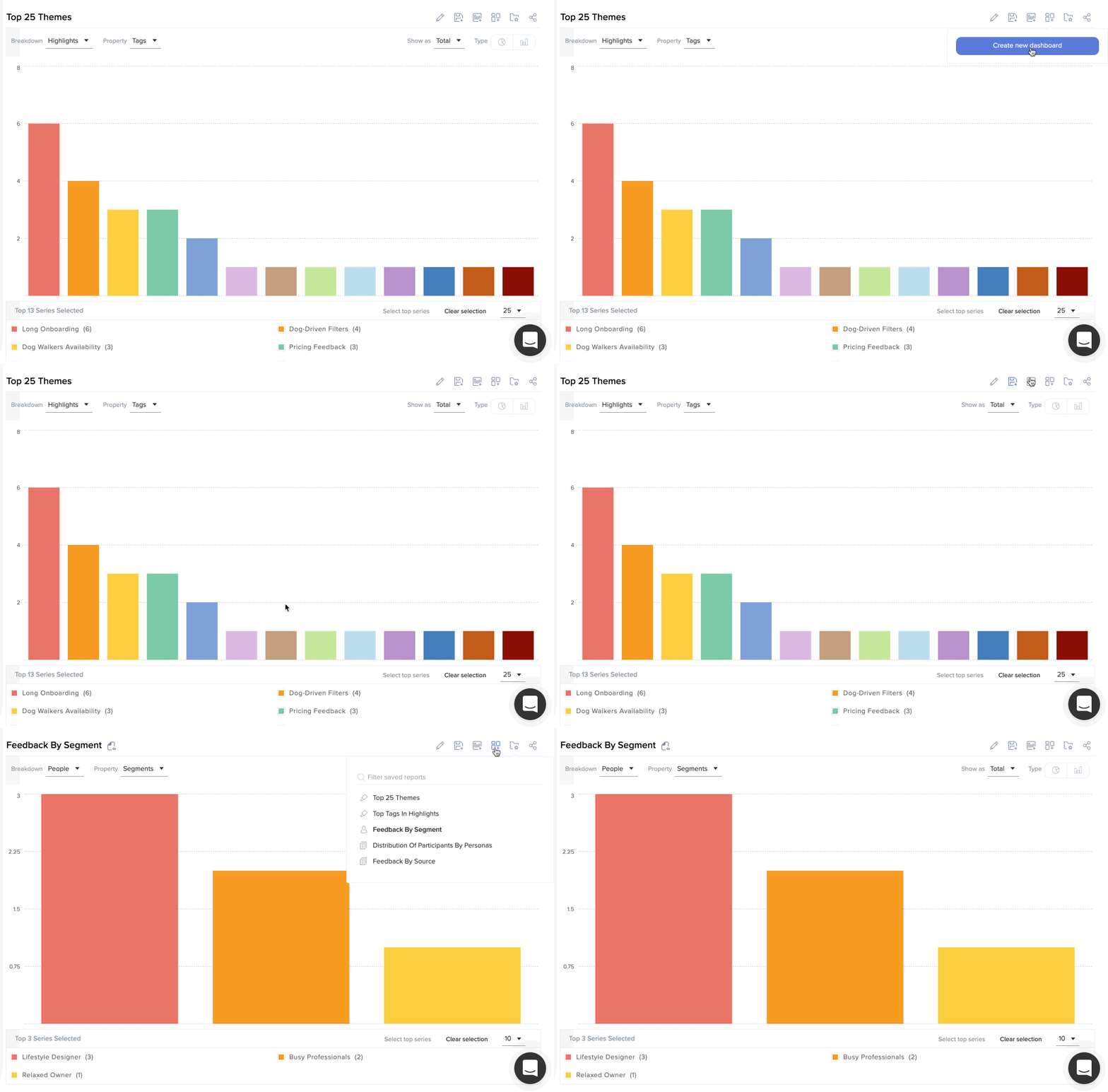
Save a new chart of your choice
"Add to dashboard" icon will appear: 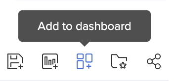
You can create a new dashboard from the dropdown - once that happens we will automatically add the current chart to the new dashboard for you
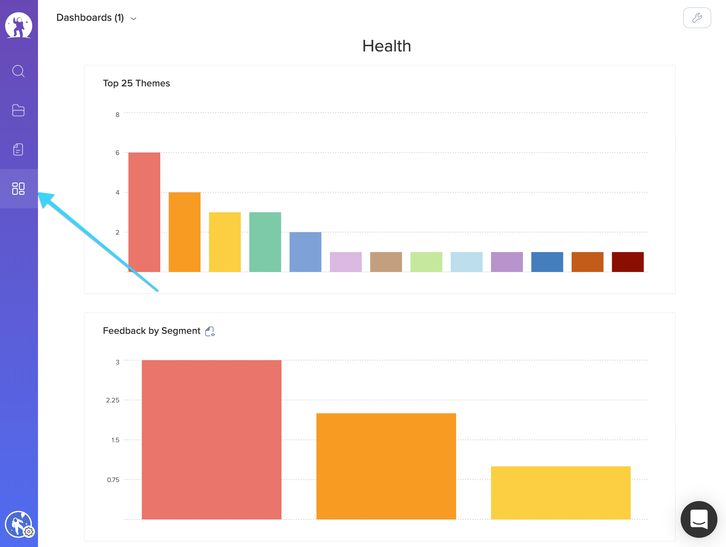
You can now access the dashboards section and manage them form there:
Important information about timezones
EnjoyHQ ingests all data assuming Universal Time Coordinated (UTC) - all dates & times are stored without any timezone information. What that means, assuming you're in California, selecting a "created at" date filter and setting it to "2021-03-19 - 2021-03-20" (documents created between 19th and 20th of March, 2021), the query will be interpreted as
- beginning: midnight 19th of March, 2021, UTC
- end: 23:59 on 20th of March, 2021, UTC
And that will translate your results to the following date ranges, in California (Pacific time):
- beginning: 5pm, 19th of March, 2021, PT
- end: 5pm, 20th of March, 2021 , PT
That also means that all the reports are calculated and displayed using UTC time as well.